Showing posts with label sarah 101. Show all posts

Sarah 101: Gabe's City Condo

It’s the last episode of Sarah 101! What did you guys think of it? I enjoyed some episodes more than others and judging from all your comments, you felt the same. Sarah moved even further away the neutral style of her Design Inc. days and introduced more colour, pattern, and mixing of furniture styles. That Sarah & Tommy – always challenging us with something new!

To celebrate the end of the first season of Sarah 101, I have a FANTASTIC GIVEAWAY!! More on that in my next post!

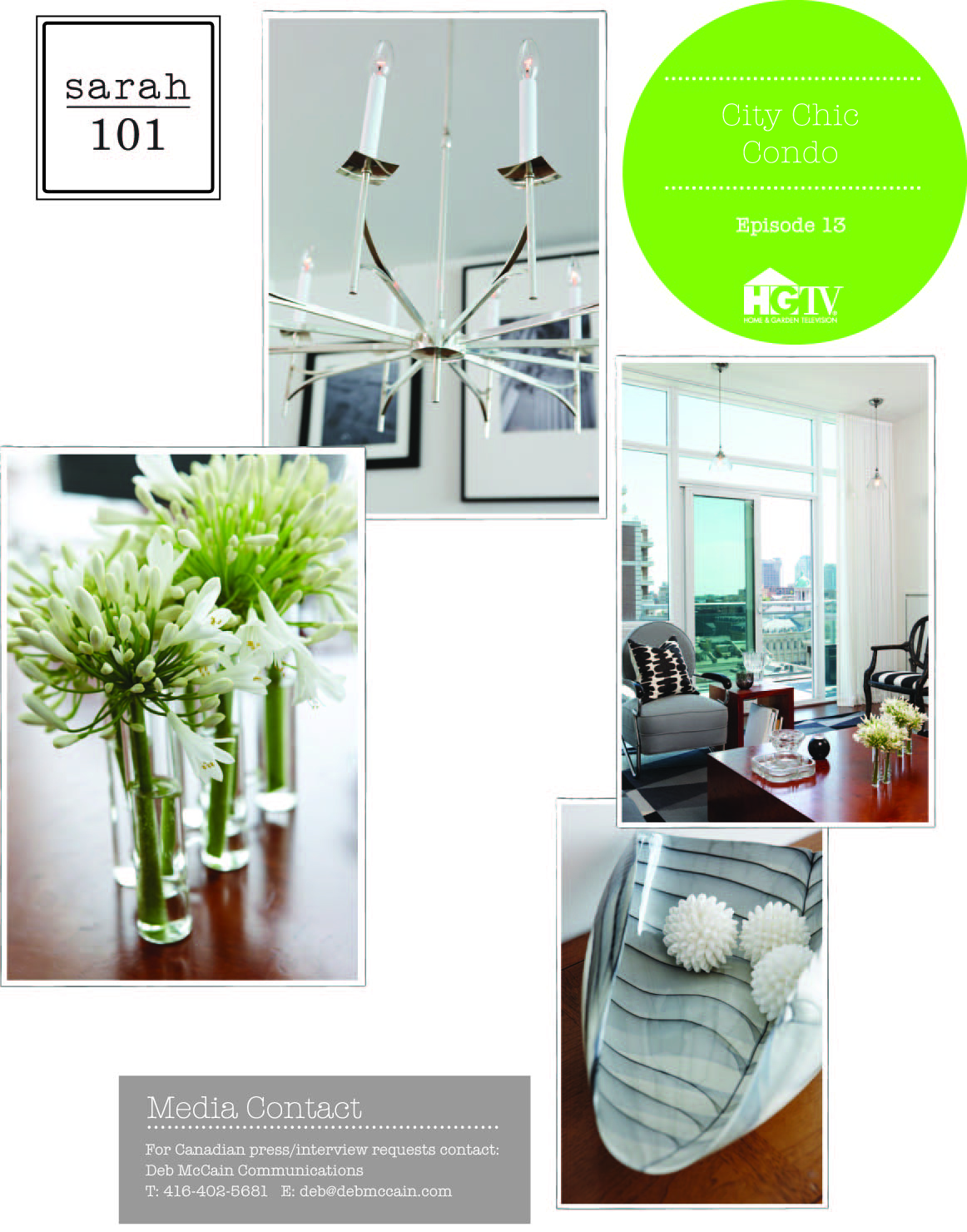
In this week’s episode, Sarah and Tommy take a blank slate of a condo and inject it with a serious sense of style. Starting with the jumping off point – a monochromatic black, white, and grey decorating scheme – Sarah and Tommy mix it up using vintage and modern pieces.

A large round vintage glass table is used to anchor the dining area. The round table is best for a small space; it allows for flow and circulation and provides flexible seating options. Paired with acrylic chairs and a sleek and airy chandelier, the glass table doesn’t feel heavy or too big in this combined living-dining space.

In the living area, Sarah again uses two inexpensive rugs bound together to create a larger statement rug. While the chairs are vintage, dramatic and full of personality, the sofa is new and neutral. A chunky vintage wood coffee table brings some warmth and needed contrast against the cool black and white and grey fabrics. Small details, like smoothing out the stippled ceiling, accenting with silver and white wallpaper, and using crisp Starfire glass in the chrome sidetables, keep the space feeling modern and masculine.

By adding unique and unusual pieces, this builder’s box of a condo gets some personality. Standard potlights are replaced with vintage pendants. Walls are adorned with large-scale DIY artwork and a gallery wall of black and white photos. The combined result is a room which feels collected over time and far from generic.

Tips from the show:

  • For professional looking framed photographs, pair ready-made frames with custom-cut mats
  • Looking to reupholster a vintage piece? Make sure its sturdy, free of wobbles, and check the original manufacturer’s label as an indication of quality
  • Black & white schemes can be harsh and high contrast. Mix them with less severe grey tones.
  • The key to a great DIY is knowing what to do yourself and what to hire a pro for (for example, getting a DIY canvas professionally stretched and framed)
  • Use black as an accent and not as the main colour in a monochromatic scheme
  • Too many black & white fabric patterns can be overpowering. Balance the look with lots of solids.


I think this was my favourite episode of the whole season! It certainly didn’t look like a budget makeover and felt suited to the homeowner. I thought it had just the right mix of vintage and new pieces. What did you think? Did you enjoy the series?

Sarah 101: Fresh Laundry

Its laundry time! This week Sarah and Tommy tackle a typical ho-hum laundry room and transform it a space with some style.

First up, finding a jumping off point. Instead of the usual fabric, Tommy takes the lead by suggesting dimpled rubber flooring. This type of flooring is more commonly used in commercial applications but it meets some specific requirements for this residential space: it will work on a sloped floor and its available in a variety of colours. Sarah chooses a fresh mint to add a feeling of water and sky to this windowless room.


The cost of the must-haves in this room – the washer and dryer, cabinetry, countertops, faucet – could be expensive so watching the budget was a priority in this episode. After choosing some standard white appliances, Sarah and Tommy opt to use a bathroom vanity instead of kitchen cabinetry for the storage cabinets in the laundry room. The vanity is a little bit cheaper than kitchen cabinetry of the same size and also comes pre-assembled.

On the opposite wall, they create more storage and folding space by pairing two storage towers from a big box store with shelves in between. Using vintage corbels to hold up the shelves adds some character and charm. Other vintage details include salvaged doors (from Legacy Vintage in Cobourg – love that place!) fitted into custom cabinets and a charming flea market chandelier. Sarah creates a cohesive look by painting all the cabinets the same sky blue and putting a glaze wash on the custom cabinet.

An inexpensive tile backsplash in a colourful checkerboard pattern adds some fun and whimsy. Sarah highlights the installation by using a crisp white grout. To keep things light and bright, the walls are adorned with yellow paint matching the yellow chandelier and cheery DIY art made out of buttons..

Tips from the show:
- flooring comes in limited colours so choose your floors first then find paint colours to match
- to save on costs, keep your new appliances in the same location as your old ones
- when using salvaged doors, make sure they are not warped, have solid joints, and are square
- yellows are one of the hardest paint colours to get right. Always try out samples on the wall.
- You can create cheap art by framing a collection of objects
- Think multi-use storage for a laundry room – rods, cabinets, shelving
- Think about what your storing and plan your cabinetry accordingly (e.g. narrow cabinets for folded sheets)
- Balance the newness and coldness of appliances with something warmer and worn

So what do you think of the space? I thought it had a certain charm but the look was a bit unfitted and eclectic for my taste. I did like seeing some money-saving tips from Sarah and Tommy – laundry rooms can be expensive!

*******

Do you realize next week is the last episode of Sarah 101? Thanks for ALL your great comments over the season!

Tune back next Tuesday... I have a great Sarah & Tommy giveaway to announce ;)

Sarah 101: Clutter-free Basement

On today’s Sarah 101, Sarah and Tommy tackled a large cluttered basement and transformed it into an organized, multipurpose family space. Seeing as I will be transforming my own basement soon, I was curious to see if there were any great tips I could pick up from the talented twosome.

Like most basements, this one had to perform many functions with room for a play area for the kids, TV space for the family, and a storage and laundry area. Originally large and open, S&T maximized the utility of the space by dividing it back up. Freestanding cabinetry was used to create different zones. Two walls of Ikea cabinets defined the laundry area and provided needed storage space. Tall cabinets and a curtain wall marked the entry to the playroom. The unsightly and sometimes smelly storage area was enclosed in a separate room.


With a good functional layout in place, Sarah used colour and furnishings to create a lively and inviting look. She mixed woods - light oak for the cabinets and warmer mahogany on the furniture – adding instant warmth. In an interesting move, the carpet only extended around the builtins (and not under them), making it easy to remove if there were a flood or staining.

Punchy red was the colour of choice, showing up in draperies, picture frame mats, and upholstery. I loved most everything except playroom curtain, which seemed a bit adult and retro. To make a basement feel less like a basement Sarah said you need to treat it like an above-ground room; layer it with draperies, accessories, artwork, and softness. I think it worked because if this were my basement, I would spend all my time downstairs!


Tips from the show:
- When mixing woods make sure you have more than one piece in each of the different wood tones
- Use track lighting when you need lots of lights but have little budget
- By using end cup mounts for drapes, they can be fully drawn all the way back. Add a centre ceiling mount for support.
- Banish clutter by having no extraneous pieces. Have only what you need.
- Choose dense patterned fabrics for kids for durability and longevity
- No matter what size your window is, putting full-length drapes on it makes you feel like your room is above ground

Sarah 101: Diane's Neutral Bedroom

When you think “neutral” do you think beige and boring? If you watched tonight’s Sarah 101, you would have seen that neutral can also mean interesting and complex. In this episode, Sarah and Tommy tackle a bedroom that just stepped out of 1982. With its bold mauve walls, dried flower arrangements, country furniture, and floral border, this master bedroom was not a place to get a restful night’s sleep.


S&T once again started with a jumping off point: fabric. They chose fabrics in colours of linen and flax, some warmer in tone, some cooler, in different textures. I was surprised that even with such a neutral scheme, Sarah stuck to her standard of using 10-12 different fabrics in the room. To add interest, Sarah covered all the walls in a tone-on-tone wallpaper with a branch pattern. Mirrored surfaces, and glossy painted furniture acted as a counterpoint to all the other flat, matte finishes.

Aside from the art and fabrics, everything else in this room was either refinished, refurbished, or vintage. Sarah modernized two armchairs by having the reupholsterer simplify their silhouettes and adding clean piping, taking them from “grandma to glama” as Tommy said. A curvy bench back was repurposed into a headboard using crisp paint and an upholstered insert. Two sturdy side tables turned glam with the addition of antiqued mirror and spraypaint. A mid-toned wood dresser was left as is, adding a bit of warmth and a hint of colour to the space.


Creating a monotone room like this one is not as easy as it looks. By varying textures, finishes, and shapes, Sarah and Tommy kept the room from being boring and bland. They really gave new life to a tired old space.

Tips from the show:
- When selecting wallpaper, go for one that looks almost hand-painted. Anything with too high of a sheen can look dated.
- Refinishing old floors can be cheaper than buying new broadloom
- When adding an accent colour in an otherwise neutral room, go for something in the same tonal intensity as the other colours. In this room, Sarah added a subtle mauve grosgrain ribbon detail to white curtains.
- Though beds tend to look best along the wall opposite the entry door, there is no rule about where they should be placed. Try them on every wall to find the best look!
- Think of your lighting as a collection. They should share some elements (e.g. all have brass accents) but some contrast too (e.g. sparkly chandelier and more straight-lined bedside lamps)
- Use your art budget wisely. You can go for one expensive statement piece that covers one wall, or more inexpensive multiple pieces that can cover more walls.

I thought this room was very similar to the spaces Sarah designed on Design Inc. It was a bit more polished and traditional. My favourite details were all the brass accents and the antique mirror on the side tables. What did you think of this room? 

Sarah 101: Lisa's Kitchen Reimagined

This week on Sarah 101, Sarah tackled a dark and dreary kitchen and transformed it into a light and fresh space. Like Tommy said, it really was a testament to the power of paint.

The original kitchen cabinets were 40 years old but made of solid pine. Deciding to keep but update the cabinets was key to keeping this makeover within the $10,000 budget. Minor changes to the layout, like moving the fridge and the location of the sink on the island, modernized the space and made it more efficient.

Using the colourful glass tile as a jumping off point, Sarah infused the space with a bright retro vibe. The cheery robin’s egg, taupe and blue palette was repeated throughout – on the tiled checkerboard floor, the crockery, and the DIY message board made out of a mirror frame, foam core, and fabric. Period details like the pendant light and industrial stools at the pull-up island added to the kitchen diner feel.

I thought the finished kitchen really was quite charming and was a great example of a budget makeover. It reminded me of the farmhouse kitchen in Sarah’s House 3:
The beadboard, newel post leg, and painted island are tricks she used there too. I really love this country style of kitchen. It’s relaxed, casual, and a great place for gathering.

Tips from the show:

  • Make the most of what you have. Salvaging cabinets and using existing lighting locations can save you lots of money.
  • Put most of your appliance budget towards the range. Cooking great food is the priority and all the other appliances are just support!
  • Be aware of sightlines. Sarah covered up an unsightly view to the laundry room by using laminated plexiglass
  • Use pre-made stair treads as decorative shelves
  • Use 1/3 tone of one of your room colours on your ceiling
  • The style of your kitchen should fit the style of your house


******

SPOILER ALERT:  And guess what… that newel post leg detail makes its appearance once more… in the kitchen of the new Sarah’s House 4, which is airing on HGTV Canada this fall. Click here for a sneak peek at the house which is currently listed for sale.

Sarah 101: Classic Ensuite

Alright, you guys are going to have forgive my lack of any real depth in this post. I tried to watch Sarah 101 twice today and was twice thwarted! The noon showing had no sound the entire episode, if you can believe it! And the little one just wouldn't go to bed so I missed the 9pm showing too. Argh. (Note to self: get a PVR!).


I would have loved to have seen this episode. Bathrooms can be notoriously expensive rooms to renovate so I would have liked to have heard Sarah's tips on where to save and where to splurge. From what I can see, she did her signature touches of mixing tiles to get an interesting and high end look, and putting an accent wall in the shower. And looky - that gray band of accent tile is the same one from Lowe's that we used in our bathroom reno.


Most of the fixtures and furnishings she used in this room were purchased in a big box store, if I'm not mistaken. I think she achieved a nice look, not too fancy but not boring and predictable either. What do you all think? And please, fill me in on what I missed!

Sarah 101: Contemporary Living

This week, Sarah tackled a long and narrow living and dining space. I think Sarah is good at many things but she is great at space planning so I was interested in seeing how she addressed this challenging layout.
She maximized the layout by using smaller scale furniture and reworking a floor plan to account for circulation space and create conversation zones. In a brilliant move, she ditched the traditional dining table and chairs and instead used a space-saving custom L-shaped banquette, round dining table, and accent chairs. The furniture tended towards the mid-century modern. Arm chairs were teak, leggy, and updated with graphic fabric. While having so much vintage furniture in a small space can feel too retro, Sarah kept it light by adding contemporary curtains and modern touches of chrome side tables, lucite curtain rods, and a glass stair rail.


She paired this with textural elements like bold grasscloth, an Egyptian brass pendant lamp (which I recently spotted at the IDS preview), and a zebra print rug. Speaking of the rug, Sarah had two rugs stitched together to get the exact custom size she needed. Smart idea! All in all, though some of the furniture isn't my cup of tea, I think the room works. Its a highly functional design and one the homeowners say has increased their use and enjoyment of the space. Really, isn't that what we're all trying to achieve in our own homes?


Tips from the show:
- use chairs to act as room dividers
- when using vintage pieces, recover them in complementary fabrics (like the geometric 1960's-esque fabric Sarah used)
- repeat pattern in a room. Use one strong statement (like a curtain) and keep others more subtle (like pillow cushions)
- choose flowers that enhance your room design. Tall, linear pussy willows worked well in this modern space
- have multiple storage spots (like storage cubes to house toys) to keep clutter at a minimum

Sarah 101: After The After

Many of you were quite interested in what Geeta really thought of her dining room and her experience on Sarah 101. While Geeta wasn't entirely happy with the chairs and artwork that were featured on the show, she was really happy with the replacement chairs that Sarah helped her pick out and the artwork she purchased on etsy.

So let's take a look at how the room looks today. Here's the Before (or is it the After?)...

...and here's the After (the After After)


Much more livable, I think, don't you? The chairs are the Cole chairs from Sarah's own line and feature a nice subtle pattern and nailhead trim at the legs. The artwork picks up on the colours in the room (though it is hung a little high because Geeta just temporarily reused the nail that the floral art was hung on!). And with the table set with more modern dishware, the whole room takes on a younger, more classic vibe than it appeared on the show.

I hope you've enjoyed this sneak peek behind Sarah 101. Thanks for sharing Geeta & Jerry! Its good to know that sometimes the happy homeowners we see on TV really are happy.

Sarah 101: Simone's Girls' Rooms

I admit it, I was getting a little blasé about Sarah 101. I've liked the rooms but nothing has really blown me away or given me that signature Sarah "wow" I was looking for. Not until this week's episode, that is.

Maybe its because I have a little girl of my own, but I just loved loved loved these rooms Sarah created for a trio of little girls. The rooms contain a mix of modern and vintage pieces, layered fabrics, sophisticated colour, and touches of whimsy.

In the nursery, Sarah painted the walls a shade of coral (can you say Honeysuckle?). She kept it from being too sweet by pairing it with bright fire-engine red furnishings and accessories. I especially loved the bold floral curtains trimmed with polka dot fabric. The room had a "collected over time" look, as each piece was unique and not too matchy-matchy. Even her finishes didn't match... natural wood on the chair, white paint on the ottoman, a yellow side table, red crib, and creamy dresser... but they all worked together because she stuck to a palette of reds, creams, and yellows.


In the shared girls bedroom, she went for a cooler palette of blues & greens. This is Sarah's favourite colour combo and she's used it many times before in tween rooms, guest bedrooms, and her own cottage. What makes this room a standout for me are the girly details like the curvy headboard and side tables, the swirly brackets, the pleats on the bedskirts, and the crystal knobs. She tied the two rooms together by using pops of yellow, and the same striped carpet in both rooms.

I loved all the DIY touches too like the painted dresser (it was naked pine originally) and especially the storage platforms she sat the beds on. Such a great idea to use velcro to attach the bedskirt to the front of the platform; its pretty and functional and keeps the baskets beneath accessible.


Tips from today's show:
- inspiration can come from unlikely objects. She used two tea towels from Anthropologie as the jumping off points for each room
- your fabrics and paint don't have to match exactly. Use a toned down paint colour for your walls and ceiling
- use carpet as another design element. Keep it fun and 100% wool for kid's rooms
- use pencil when making markings on walls. Pen will bleed through paint.
- vintage furniture is often inexpensive and durable. Use your savings to splurge on blingy handles or knobs to dress up the piece
- consider placing twin beds end to end instead of side by side or in a bunk bed configuration. This makes the room feel more open and gives each child one half of the room to consider their own.

What did you think? Did you love it as much as I did? Or maybe this room just appeals to the other mommas out there?

Sarah 101: After The Show

Wow, looks like most of you love Geeta & Jerry's dining room! But what do Geeta and Jerry really think of it? And was appearing on Sarah 101 the dream experience we all think it to be? Let's find out...

How did you get on the show?

After finding that they were having a casting call on your site (thanks Jennifer!!), I filled out the application and submitted the required photos. The questions were pretty simple about my husband, Jerry, and me (what we do, our age, etc.) and where we live (city, detached/semi/condo, etc.", "what do you like/dislike about the room?", "what's your design style?", "how will you be using the room and what's your desired style, colour palette, and wish list?", "what would you splurge on?", "what makes this room an interesting episode?", "what's your budget?", "what are the dimensions of the room and what's its exposure?". 


We filled out the application at the end of October 2009 (I think ?), and the Producer and Lindsay (the Design Inc. intern!) came to our house in mid-November. Funny enough, we put in the application for our living room (our entire house was a mess as we had only taken possession of it for a couple of months then, so really any room being done by Sarah would have been a blessing!) but as we gave them a tour of the house they asked us if we were willing to have our dining room instead of the living room as they received a bunch of other applications for living rooms and wanted to do something different, and our answer was "of course!!". In December 2009 they said we were one of the 12 rooms to be chosen but we would have to do an on-screen interview with mostly the same questions from the application/house tour to make sure we don't freeze on camera, and as long as we didn't freeze, we would be in the show...so much pressure...poor Jerry was super nervous, especially since he had to wear make-up for the first time too - LOL! :)

How much input did you have into the design?

Not much. Other than what we said our style was like in the application and when we meet with the Producer in December and November, we didn't really know what was going on. In the middle of them taping the show, they showed us the wallpaper (which I LOVED) and the china (which I said was okay, but looked kind of granny-ish...Sarah wrote back and said she agreed and it was just going to be a prop)

Were you happy with the finished product? Did you keep everything as is, or did you change some things?

I am THRILLED with the room...as it looks now, but maybe not as much then. I love, love, LOVE the wainscotting, paint colours, floor treatment, dining table, and LOVE the sideboard table. I wasn't very happy with all the floral fabric on the chairs and the floral artwork, but those were easy to change. In fact, we gave back all the props (china, glassware, cutlery, etc.) and gave back the art and chairs too, and Sarah personally helped us find chairs from her own line (specifically, the Cole dining chair which you can see on her website, www.sarahrichardsondesign.com), helped us pick fabrics that both parties liked and thought would go well with the room, and lowered the price so we could get it in our budget. She was AMAZING! We also just bought a painting from etsy to go in the room (it should arrive in a day or two), that I'm hoping will work really well in the room (http://www.etsy.com/transaction/42469522). Now when I walk by/in the room I always have a smile on my face since I love it (& I'm hoping that love will grow more once I get this painting on the wall!)..I'll take a pic of the room when it's up so you can see the finished result!

Did you have to pay for any of the design?

They put in 10K and we put in 3K. After doing some of the ground work (wall and floor treatments) and buying the dining table and sideboard, they said they pretty much used up the budget and asked if we could contribute more. We said we would be willing to put in another 3K, if what they bought was good value for that money and if we liked it. As we didn't like the dining chairs, which they said were almost the entire 3K budget, we returned those, and instead bought Sarah's Cole chairs with a fabric we liked instead later on.

What are Sarah & Tommy really like?
We never met Sarah once!!! It was my biggest regret since they always came to the house in the middle of a work day, and I was going to stay behind one day to meet her, but the producer said that there would be plenty of times that I would meet her, but it never happened :( However, Sarah and I emailed many times this year and I found her to be very helpful and charming! Tommy, I only met once when we were being taped about what we thought of the finished room, but it was very brief, just a simple handshake and a "it's so nice to meet you!" I really wish I could have spent more time with them, but I know how busy they are and just really appreciated the interaction that they had with us and what they did for us in the dining room.

Thanks again for telling us all about the casting call...I'm stilling pinching myself over having a Sarah dining room!! :)

Geeta

*********

Thanks for filling us in on the back story Geeta! How wonderful that you ended up with a room you love. We should all be so lucky to have a Sarah dining room! And if any of you have any more questions, just ask in the comments and I'm sure Geeta will chime in.

Sarah 101: Geeta and Jerry's Dining Room

A new Sarah 101 episode today, and this time its Geeta and Jerry's dining room! Geeta is a reader of this blog and I'm happy she found out about the Sarah 101 casting call through one of my posts. I was quite excited to see how her space turned out! Let's get to the recap, shall we?


S&T set out this week to create a little jewel out of a boring box. And what a jewel it was, because by the end of the show, the dining room was completely blinged out! Not one surface was left untouched - walls, ceilings, floors all got that special Sarah treatment. Using a set of shield-back chairs (from the Elegant Garage Sale, one of my fave local haunts) as her jumping-off point, Sarah came up with a design that was decidedly more funky but traditional than some of her previous work on Sarah 101. Although the chairs cost Sarah $33 each, after she had them restained, covered with a floral silk on the back and graphic print on the front, the chairs ended up costing $350 each. Quite an investment! Paired with the $3200 antique dining table and the antique sideboard, they looked fabulous and stately.


Much like my own dining room, Sarah installed a bold patterned wallpaper above a chair rail and molding. A fully wallpapered room would have been too overwhelming, don't you agree? I'm not sure I'm too keen though on the multi-coloured paint treatment she gave the panels. I tend to like panelling the same as the trim, in a warm white. I LOVED the wallpaper though... the blue-grey colour picked up on the blue-grey in the floral silk, and the gold scroll details mixed perfectly with the gold toned mirror, understated chandelier and yellow accents. Such a pretty and elegant look.


All in all, this was one well coordinated room. Every detail was thought out and repeated creating a very full and lush design. I imagine that using the room is a delight because you're always finding something new to look at!

Tips from today's show:
- when using wallpaper with a large design, discuss the placement and repetition of pattern with your installer to make sure it looks even on all sides
- rectangle dining tables are the most versatile
- repeat your motifs to create a cohesive look. In this room, Sarah repeated a Greek key design on the painted floor treatment, mirror, and chair fabric. She also repeated the step profile of the crown molding on the wall panelling and chair rail.
- pull a colour from one of your fabrics and use a watered down version for your ceiling paint
- when you have a lot of patterns and fancy elements, balance them with some simpler details

What did you think of the room? There's parts of it I loved, and other parts I thought a little "grannyish", but overall I think its a beautiful dining room for family celebrations.

*****

AND... you're in for a treat. Have you ever wondered what the homeowners really thought after the show? Did they really like the design - or rush to change it once the cameras left?? What were Sarah and Tommy really like?? Come back tomorrow because Geeta and Jerry are sharing the secrets on what it was like to be on Sarah 101!

Sarah 101: Andrew's Bedroom

On Sarah 101 this week, Sarah and Tommy tackled a large loft space. The loft, in a former baseball-making factory, belonged to a single guy so you would think it be designed as a more masculine space. What they ended up with was something both feminine and masculine which I like... what do you think:

Where to start decorating when you have a room this large? Fabric! And in this case, the bolder, the better. Sarah used Schumacher's ubiquitous Chiang Mai dragon fabric (at $150/yd!) as her jumping off point. I love this fabric but would a guy, a straight guy, love it enough to put it on his headboard? Any guys care to chime in on that? She paired it with leather sides on the bed and added nailhead trim. One interesting detail: she cut out the headboard corners to line up with the window sill. Think of these details - that's how you get a perfect, custom look.


Anyway, from this fabric, the rest of the decor palette fell in place... mustard yellow and teal paint on the walls, antique red carpet, bold yellow lamps, linen & teal draperies, blue stools. The teal was brought in again on the ring pattern fabric on the masculine wing chair. Other details included the personal heirlooms made into art, and the big large scale accessories like the ladder and reworked vintage mirrors.

A few more tips from Sarah:
- work with the style of the space. The loft had a rough, industrial vibe which they echoed in the industrial chic accessories
- with a bold fabric (like on the wing chair), use a contrasting piping to emphasize the shape of the piece and support the "heaviness" of the fabric
- in an open concept space, you can change the paint colour anywhere you have a sharp corner. Its easier to change at an inside corner (where two walls meet) because your painting doesn't have to be super precise
- use a rug to add human scale to a large space
- in a single room, drapes should be all the same fabric but you can change up the application. Here, Sarah mixed roman blinds and drapery panels
- running a rug perpendicular to your bed means you'll have comfy walking space around the perimeter of your bed
- best location for a bed is on the wall you first see when you walk into the room

Lots of good tips this week! I think too the episodes are getting better. We got to see more of that Tommy & Sarah playfulness this week - and Tommy got a bit more input into the design this time around!


** Don't forget to tune into Sarah 101 next week. I think they're featuring Geeta's Dining Room, and as you may know, Geeta found out about the Sarah 101 casting call right here on this ol' blog :)

Sarah 101: Vernon's Kitchen

Another episode of Sarah 101 and this time its a kitchen! Like I posted before, Sarah is brilliant at using Ikea cabinetry to create a custom look and this episode really showed off her mad skills.


The "before" kitchen was every cook's nightmare... a very small space, lacking storage, and poor layout. It was a galley kitchen with an island parallel to the wall of cabinets. It was so tiny you literally had no room to move about if the oven door was open! I really didn't know how Sarah & Tommy were going to "fix" this kitchen.

Once again, Sarah proved why she's the top designer by doing away with the free-floating island and replacing it with a peninsula (try for a dimension of 3'x5', she says) perpendicular with one of the galley walls. That small change really opened up the space, improved traffic flow, and connected the kitchen with the adjoining lounge, while still maintaining a bit of visual separation. Brilliant!

The cabinetry was Ikea but some doors were professionally sprayed to give it a custom look. My favourite touches were the vintage pendants, the cohesive green & white palette in both rooms, and the emphasis on creating functional yet still stylish rooms. If you've been a fan of Sarah's since her "Room Service" show days, you'll be pleased to see she pulls out the old vinyl decals for a bit of old school DIY'ing too.

Tips from today's show:
  • Create designated workspaces. Have dedicated lighting (pot lights) in each work area, then add some decorative lighting for panache
  • Tie a colour in two adjoining rooms by using accent pillows. Further unite the spaces with the same flooring material.
  • Every space needs softening. Do that with fabric!
  • In a room with low ceilings, mount your curtain rod high to elevate the ceiling
  • In a room with no architectural interest or details, do something to add some pop in the space. In this episode, Sarah put a vertical stripe which went up the middle of one wall, across the ceiling, and down the other wall. Unconventional and interesting!
So, what did you think? Is the series growing on you?

Sarah 101: Trish's Nursery

Time for another recap of the latest Sarah 101 episode, so avert your eyes if you haven't seen the episode yet!

In this episode, Sarah tackles a modern nursery for a little boy. I was looking forward to this episode because Sarah really was one of the forerunners of creating stylish nurseries that aren't overly themed or babyish. Here's the nursery Sarah created for her own daughter five years ago, back on Design Inc:


And here's the new nursery she created for Trish on 101:


Some of the elements are consistent like:
- bold fabrics in sophisticated patterns
- a limited colour palette. Even the toys and accessories blend into the blue & orange colour theme
- contrasting piping on the furniture
- modern lighting fixtures
- a repetition of pattern (striping on the walls, on the banquette, on the toy boxes)
- non-traditional rocking chair
- a space that is comfortable for adults and children
A bit disappointingly, aside from the dramatic ceiling (which is a feature made popular by Jenna Lyons famous yellow & white striped nursery), there isn't too much in the room that was novel or new. Is it wrong to expect Sarah to come up with an "OMG" design every time? I mean, really, how much can you do with a nursery?
But I guess that's not the point of Sarah 101. Its aim is to give you tips on how to create a stylish Sarah-look in your own home, on a budget. On that, she delivered. Here are some of the tips from today's show:
Think Long Haul: Babies grow up so any room designed with cutesy baby-ish things risks looking dated and juvenile by the time Junior outgrows his crib. Instead aim to create a sophisticated space and decorate with furniture and accessories that you can use today and in the future (like a funky chair for nursing that you can move to the living room after).
Add Vintage Charm: This is a rule I use in my own home - every room needs something a little old! In Chloe's room, it was the crocheted doilies she inherited from her great-grandmother and the vintage desk we found at an antique fair. Not only do vintage pieces make your space unique, they can help teach your little one that not everything is disposable and also gain an appreciation for old school craftsmanship.

Art You Can Afford: Whether its framed $3 flash cards like Sarah used or your little one's latest finger-painted masterpiece in an Ikea frame, this is one area you don't have to splurge. One of my favourite ideas is framing pages of your childhood storybooks. Cheap & cheerful!
Play With Pattern: Do you know that Sarah typically uses 10-12 fabrics per room? Astonishing! You'd think that so many fabrics would create a clash of patterns, yet Sarah's rooms are always soothing, calm, and coordinated. How does she do it? She uses a mix of scale (small, medium, and large patterns), is deft at placement (bolder patterns are typically left for accent furniture and draperies) and is master at mixing colours.
Double Duty: Kid's rooms are typically the smallest rooms in the house, so pieces should do double-duty when they can and save on space. Think side tables that are also storage, benches with built-in bookshelves, even hanging cute baby outfits as art. In our own home, we did away with a change table and placed the change pad on our double-dresser.


So what did you think of the nursery? How are you liking the new Sarah 101 show? Me - I think its good for those who don't have much design knowledge, but I personally like the "hard core" decorating/renovating/DIYing of shows like Sarah's House better and find them more inspirational.

Sarah 101: Debbie's Living Room

*** spoiler alert ***

If you didn't catch Sarah 101 last night and don't want to see what the room looked like, don't read any further!
*
*
*
*
*
*
*
*
*

And for the rest of you (including you American readers who can't wait until Sarah 101 hits HGTV US!), here's the low-down on the Sarah & Tommy magic from last night's episode:

S&T worked on a typical Toronto home. In fact, you may notice that the layout is very similar to my own home, minus the walls between the living room and dining room and the wall to the basement. The problem with these homes is they are not very big so you need to maximize space and pick furnishings to suit.

It was great to see the signature Sarah style back in action - a great mix of patterns, clever use of tile, and comfortable livable rooms. Sarah continued to use a bolder, more colourful palette; gone are the muted creams, greens, and blues from Design Inc. days. In this episode, she used a playful & graphic Josef Frank-ish floral fabric from my fave store Designer Fabrics as her jumping off point and paired it with apple greens, raspberries and pinks.


Sarah 101 is like a recipe book where S&T give you the ingredients to make a spectacular space. A few of my favourite tips from this episode:

- save silks for window treatments where they're away from sticky fingers and everyday wear and tear
- make a small window look bigger by using two panels on either side, with the patterned panel on the exterior
- choose a mid-toned colour for your floors for a timeless look. Anything too extreme, too dark or too light, will look dated at some point. And if you have pets, never choose dark floors which show all the dirt and hairs!
- put a bold fabric on a smaller piece of furniture. That graphic floral on the large sofa would have overwhelmed the space, according to S&T.
- consider good solid vintage pieces for furnishings. That dining table with three leaves was $150 and Sarah had it refinished for $500. Still a good investment.
- a daybed is a great for helping define the living room area, but it doesn't block sightlines
- think about piping. The contrasting piping on that reupholstered sofa makes it just a bit more interesting, don't you think?

So that was episode 1. Did you watch it? Any favourite elements? We're talking about it too on my Facebook page so let me know what you think.

Behind The Scenes: with Sarah & Tommy Part I

Yesterday was THE day. The day that I and a bunch of other very lucky bloggers got to spend some quality time with Sarah Richardson and Tommy Smythe. And how fun it was... Sarah was the perfect hostess, plying us with tea and munchies, giving us free reign to poke around and take photos. It was a casual, laid-back hour+ of conversation. I could have sat in that oh-so-comfy chair (designed by Sarah of course) all afternoon if they'd let me!

There was so much we talked about (and I'm sure you want to hear all the inside info) so I'll do a two-part post about the event. Today, do you want to take a peek at the Sarah Richardson Design offices?

I arrived at Sarah's downtown Toronto office eager to see the space where she works and creates. I had seen its transformation on an episode of Design Inc. so was curious to see if it had changed. It was a bright white open concept office in Sarah's signature palette of soft greens and blues.

Vanessa, Christine and Stacie checking out the office. That's Lindsay working away in the background. Remember her as the intern on Design Inc.?

There were furniture pieces designed by Sarah all around the office. Here's the sitting area near the entry. I could easily have this as my living room. Look at the fab chandelier!

We assembled for a group photo before the interview. I think we were all a bit excited and nervous...
...but as soon as Tommy jumped into the pic, we all loosened up a bit!

A few vignettes around the office: a stylish bookcase and chair. Lots of pattern on the fabrics and on the books!

Not even this little corner was left forgotten. Lovely ethereal artwork on the walls (and TV equipment hanging overhead).


A table piled high with inspiration. Wonder what the gnome was for? And Sarah's kitchen behind. I loved the full tiled wall and that white metal artwork.

A gorgeous wheatsheaf table.


And the fabulous boardroom! Love that thick marble table and ornate mirror. Of course, I had to take a peek at Sarah's inspiration board. Hmm, I see lots of pics of striped stairs! New trend alert folks ;)

So that's a look behind the scenes at Sarah Richardson design. Next post, I'll tell you all about the new show, Sarah 101, and share why I think Sarah is the smartest woman in design today.


(and that's why these folks are on TV. Its impossible to take a bad photo of them!)