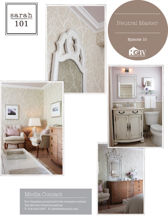
S&T once again started with a jumping off point: fabric. They chose fabrics in colours of linen and flax, some warmer in tone, some cooler, in different textures. I was surprised that even with such a neutral scheme, Sarah stuck to her standard of using 10-12 different fabrics in the room. To add interest, Sarah covered all the walls in a tone-on-tone wallpaper with a branch pattern. Mirrored surfaces, and glossy painted furniture acted as a counterpoint to all the other flat, matte finishes.
Aside from the art and fabrics, everything else in this room was either refinished, refurbished, or vintage. Sarah modernized two armchairs by having the reupholsterer simplify their silhouettes and adding clean piping, taking them from “grandma to glama” as Tommy said. A curvy bench back was repurposed into a headboard using crisp paint and an upholstered insert. Two sturdy side tables turned glam with the addition of antiqued mirror and spraypaint. A mid-toned wood dresser was left as is, adding a bit of warmth and a hint of colour to the space.
Creating a monotone room like this one is not as easy as it looks. By varying textures, finishes, and shapes, Sarah and Tommy kept the room from being boring and bland. They really gave new life to a tired old space.
Tips from the show:
- When selecting wallpaper, go for one that looks almost hand-painted. Anything with too high of a sheen can look dated.
- Refinishing old floors can be cheaper than buying new broadloom
- When adding an accent colour in an otherwise neutral room, go for something in the same tonal intensity as the other colours. In this room, Sarah added a subtle mauve grosgrain ribbon detail to white curtains.
- Though beds tend to look best along the wall opposite the entry door, there is no rule about where they should be placed. Try them on every wall to find the best look!
- Think of your lighting as a collection. They should share some elements (e.g. all have brass accents) but some contrast too (e.g. sparkly chandelier and more straight-lined bedside lamps)
- Use your art budget wisely. You can go for one expensive statement piece that covers one wall, or more inexpensive multiple pieces that can cover more walls.
I thought this room was very similar to the spaces Sarah designed on Design Inc. It was a bit more polished and traditional. My favourite details were all the brass accents and the antique mirror on the side tables. What did you think of this room?


